Shall we discuss your project?
Please fill out the form
Recording for audit
Leave your contacts and we will find a convenient time


#DESIGN
By the end of 2024, the number of mobile users worldwide will reach 7.1 billion, highlighting the importance of adapting websites and applications for mobile devices. This ensures user engagement and competitive advantage. Let’s explore why a mobile-first design should be considered for your project.
What is Mobile-First Design? Mobile-first web design is an approach that prioritizes creating web solutions for mobile devices. Primary components are developed first, while secondary ones are added later, a process known as progressive enhancement. This allows users with small screens to access key functionalities immediately.
How Does It Differ from Responsive Web Design? An alternative to mobile-first design is responsive design, which adjusts to the screen size of the user's device. This approach uses dynamically collapsing blocks to stretch content.
The Difference with Graceful Degradation Graceful degradation is another approach where a complex version of the project is created first and then adapted for mobile devices. However, this often results in a compromised user experience, so it must be used carefully.
The increasing number of mobile users is not the only reason to choose mobile-first design. Here are additional benefits:
Improved SEO. Search engines, especially Google, prefer mobile-friendly web solutions with high loading speed. Websites and applications optimized for mobile users gain an advantage in search results.
Better User Experience. Users expect web resources to work effectively on any device. Mobile-first design ensures compliance with these expectations.
Variety of Available Technologies. Evolving mobile development technologies enable the creation of modern web solutions with advanced functionalities.
Higher Conversion Rates. Optimization for mobile devices reduces bounce rates and improves conversions by making it easier for users to make purchases or take other actions.
More Effective Analytics and Marketing. Mobile-first design allows for more data collection on user behavior, helping businesses develop more effective marketing strategies and analyze results.
Enhanced Competitive Advantage. Mobile-first design differentiates businesses from competitors, attracting more customers and improving their experience.
The WebMedia team focuses on two aspects when developing solutions with mobile-first UX design.
Google Core Web Vitals
This platform generates reports on page performance based on user interaction data. WebMedia employs the following practices:
Speeding up page loading through media file compression, caching, and reducing server response time.
Ensuring interactivity with JavaScript.
Maintaining consistent page layouts regardless of screen size.
Google CrUX (Chrome User Experience Report)
These reports describe how Chrome users interact with your web solution. The data is available in PageSpeed statistics, Google BigQuery, and other tools, providing unique insights to improve user experience.
Mobile-First & the Software Development Lifecycle
The mobile-first development strategy involves all traditional steps, but with a focus on providing a high-quality experience for mobile users.
How to Implement a Mobile-First Design Approach and Achieve the Best Results
WebMedia has developed a formula for successfully implementing mobile-first projects, ensuring simultaneous development of both mobile and desktop versions.
How We Build Our Mobile-First Projects
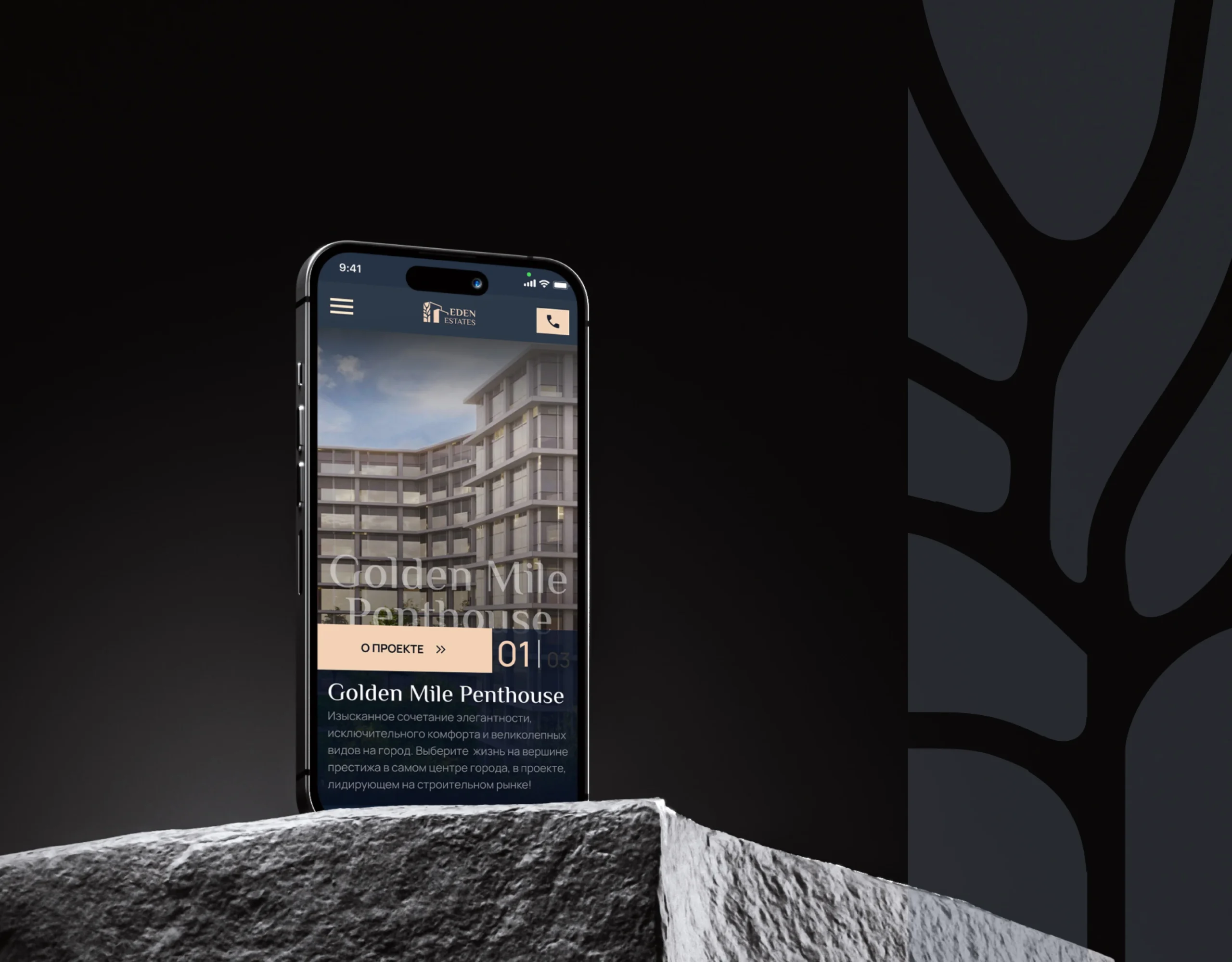
WebMedia developed a unique software solution for presenting and selling real estate in 22 countries, enhancing the client's status and simplifying daily tasks for employees.
WebMedia uses the following practices to create competitive and SEO-friendly mobile-first solutions:
Prioritization of Functionality and Content. Identifying core features and content that users will seek in your web app or website.
Use of Modular and Flexible Components. Modular components adapt easily to different screen sizes, ensuring consistency and usability.
Creating Simple, Mobile-Friendly Navigation. Intuitive navigation enhances user interaction, positively affecting the overall user experience and conversion rates.
Thorough Testing. Multi-stage testing using various tools simulates the operation on mobile devices, ensuring quality.
Despite the challenges of mobile-first design, the WebMedia team overcomes them, consistently launching successful projects fully adapted for mobile devices.


92% of consumers trust brands that tell stories. This Nielsen data highlights the obvious: storytelling is no longer a creative luxury — it’s a practical tool that influences user behavior and business metrics. Especially when applied through the Hero’s Journey framework in the digital space.

Remember the scene where Neo chooses between the red and blue pill? The blue pill — stay in the familiar world. The red pill — learn the truth. In 2025, businesses face the same choice: stay in the past or step into Web3. Nike, IKEA, and McDonald's have already made their choice. What about you?

In 2025, mobile apps remain a critical tool for businesses: 57% of internet traffic is generated through them, and mobile market revenues have surpassed $500 billion. However, the choice between native and cross-platform development has become more complex due to advancements in technology and the emergence of new frameworks. For instance, Kotlin Multiplatform Mobile (KMM) and Flutter 4.0 have narrowed the performance gap between the two approaches, while AR/VR and AI integration have become standard for many apps. The goal of this article is to help businesses consider key factors and choose the optimal development path.

Have you ever wondered why apartment prices can jump sharply within a month? Why does one house sell for millions while the neighboring one costs a fraction of that? Real estate valuation used to be simple: you’d look at the area, the floor, the neighborhood, and the condition of the property to set the price. But here’s the problem: this method is inaccurate. It doesn’t account for hundreds of factors that truly affect a property’s value.

If you work in a real estate agency, you’ve likely faced challenges in keeping your website up-to-date and engaging with clients on mobile devices. A Progressive Web Application (PWA) might be the solution to these challenges. But what exactly is PWA, and why does it matter for your business?
The Digital Twin system changes the approach to real estate management. Accurate 3D models, wear forecasting, cost reduction, and successful use cases.
Creating a marketplace is a complex, step-by-step process that requires a clear understanding of business goals, market specifics, and audience needs. Let’s break down the key stages of development, highlighting challenges and opportunities to consider.
After reviewing over 150 e-commerce projects, we identified several key factors that can enhance any online store's position and make it uniquely attractive to today’s customers. Here’s a breakdown of what we discovered: